
Figure 4.
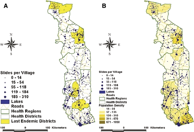
Geographic distribution of patients sampled in 2006 and 2007. A plots the number of patients sampled in each location compared with the endemic districts (shown in yellow). B shows the sample plot compared with the underlying population density in Togo.