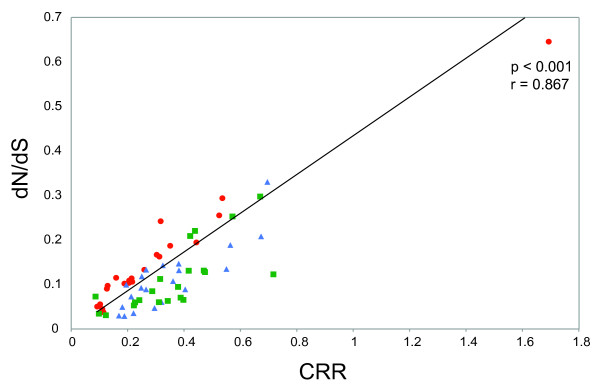
Figure 3.
Scatterplot of the codon rate ratio estimate for each partition, versus the average dn/ds ratio, calculated using PAML. Colouring is the same as that in Figure 1: among host subtype 1a data set (green squares), among host subtype 1b data set (blue triangles) and within-host data set (red circles).

