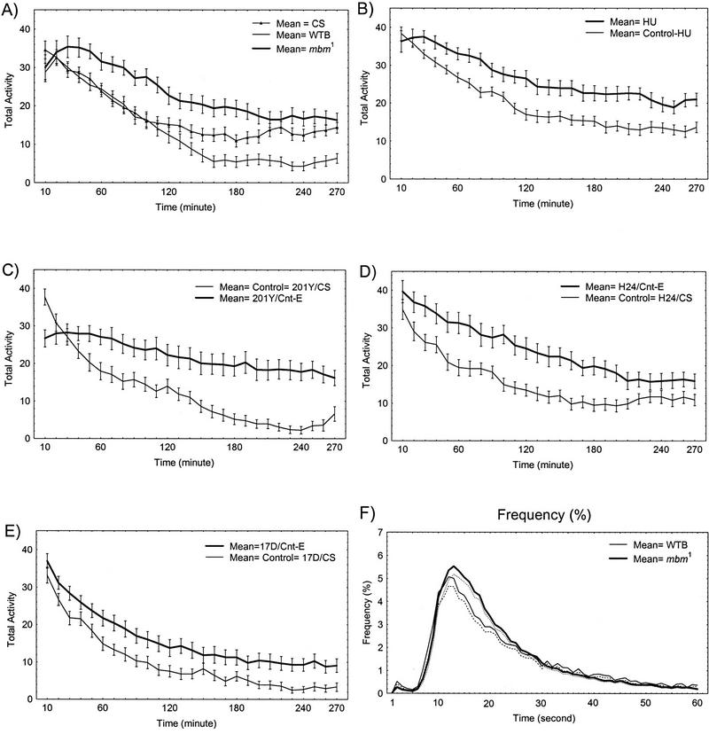
Figure 3.
(A–E) Time course of walking activity for each group of MB-disturbed flies compared to their respective controls. The curves represent the means ±s.e.m. of activity for successive 10-min periods. See legend in each graph. Same data as in Fig. 2. In F as an example, histograms (plotted as a continuous line) of the relative mean frequency [%; ±s.e.m. (dotted curve)] of ICIs over increasing ICI duration between 1 and 60 sec are shown for mbm1 and its controls.

