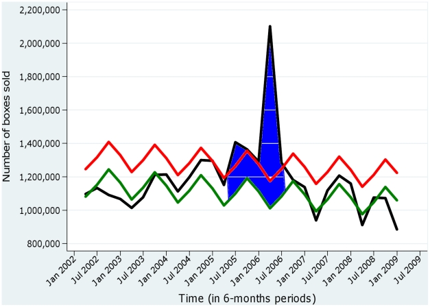
Figure 3. Excess sales of analgesics observed during the Chikungunya epidemic on La Réunion, 2005–2006.
The black curve represents the observed number of boxes sold, and the green curve the expected number of boxes sold. The red curve represents the upper limit of the 95% prediction interval. Excesses are represented by the areas painted in blue (source of the data: IMS Health).

