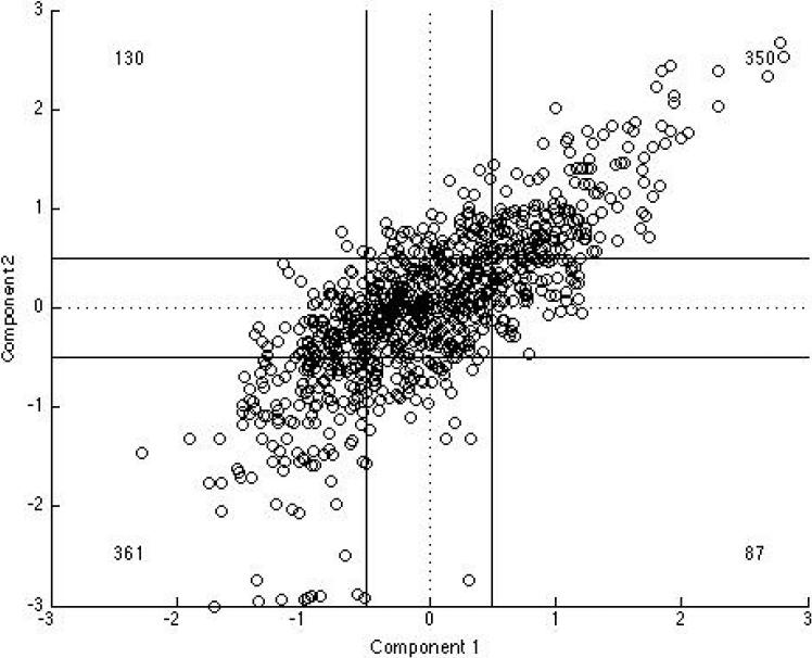
Figure 1. Scatter plot of C1 and C2 scores.
Figure 1 shows the relationship between Component 1(C1) and Component 2 (C2) scores for each participant. Component scores were created for all participants by multiplying their normalized test scores (individual score- mean/SD) by the corresponding factor loading for each test and then averaging over tests. The solid lines mark .5 standard deviations from the mean on each component. Numbers presented in the corner of each quadrant represent the number of individuals falling in each quadrant.

