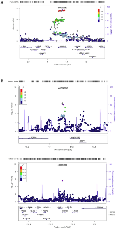
Figure 4. A close up of the association signal at previously reported and new candidate regions for male mean recombination rate.
The figures show the p-values across the candidate regions for the genotyped and imputed SNPs plotted using the LocusZoom software [51] (only SNPs with an rs numbers are shown, but plots using all SNPs were qualitatively similar). The 1000 Genomes Project data [31] was used for the imputation in all LocusZoom figures, with the exception of Figure 4A for which HapMap data were used (as in this region LD patterns in the 1000 Genomes data were inconsistent with those from HapMap and the AGRE and FHS samples). The imputation-based approach uses a different test statistic than we employed in our analysis [32], so p-values can differ slightly from those reported in the main text. The focal SNP (with the lowest p-value) is plotted as a purple diamond; other data points are colored according to their r2 with the focal SNP; SNPs with missing linkage disequilibrium information are shown in grey. A. Association of male mean recombination rate with SNPs in RNF212. B. Top associations for male mean recombination rate.

