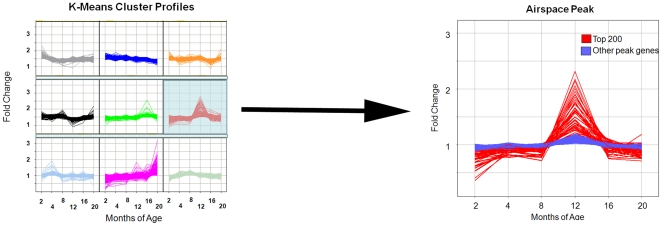
Figure 3. Schematic of selection of K-means cluster profile that temporally approximates airspace enlargement.
Nine profiles generated by random selection for difference from evenly spaced profiles are depicted. The profile whose peak corresponded to the onset of airspace enlargement is enlarged on the left. Red shows the top 200 genes. Blue shows the remainder of genes within the cluster.

