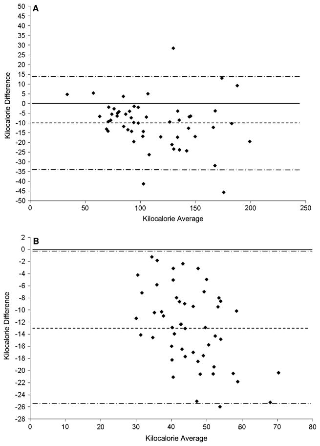
Fig. 2.
Bland–Altman bias plots for the laboratory (a) and field test (b). Kilocalorie average denotes average of kilocalories from the multi-sensor board, and calorimeter and kilocalorie difference is kilocalories from the multi-sensor board –kilocalories from the calorimeter. The mean difference in energy expenditure between the MSB and criterion is represented by the dashed line, with the 95% prediction intervals represented by long dash dot lines

