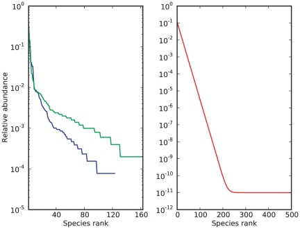
Figure 4. Rank curves associated with the human-gut, human-hand and exponential urn.
In a rank curve, the relative abundance of a species is plotted against its sorted rank amongst all species, allowing for a quick overview of the evenness of a community. On the left, rank curves associated with the human-gut (blue) and -hand data (green) show a relatively small number of species with an abundance greater than 1%, and a long tail of relatively rare species. The right rank curve of the exponential urn (red) simulates an extreme environment, where relatively excessive sampling is unlikely to exhaust the pool of rare species.

