FIG. 1.
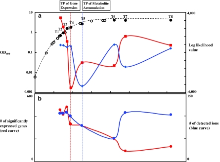
Transition point (TP) analysis. (a) Growth curve of E. coli and log-likelihood values by LDS analysis. First and second axes correspond to OD600 and log-likelihood values, respectively. Red and blue curves correspond to means of forward and backward time direction log-likelihood values calculated by LDS for gene expression and metabolite accumulation profiles, respectively. Eight sampling points are indicated by black circles with T1, T2, T3, T4, T5, T6, T7, and T8. Estimated transition points by using gene expression and metabolite accumulation profiles are indicated by vertical red and blue dot lines through (a) to (b), respectively. (b) The number of genes with significantly abundant mRNA and detected ions. First and second axes correspond to the number of genes and detected ions, respectively. For genes with significantly abundant mRNA, the threshold was set to be Mean + 1.5 × SD for Cy5 intensity values after normalization. Probe intensity values were used because mRNA abundances at each time point rather than profile changes through cell growth could affect transition points of the whole cell.

