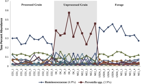
Fig. 2.
Multiple-line scatter plot showing percentages of GAST taxon abundance across all 30 individual samples organized by population and management groupings. Lines are coded by color and symbol for each GAST taxon assignment. A key for the two taxa that exhibit a management grouping response in the percentage of abundance is given below the plot. The overall percentage of abundance across the entire data set for each of these two taxa is given in parentheses.

