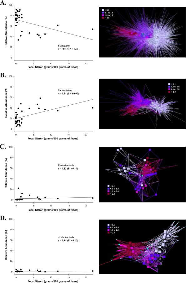
Fig. 7.
Responses of Firmicutes (A), Bacteroidetes (B), Proteobacteria (C), and Actinobacteria (D) populations to fecal starch concentrations. Scatter plots depict the relative abundance of the phylum plotted against the fecal starch concentrations of the respective samples. The correlation coefficient (r) based on a simple linear regression model is given in each graph. Corresponding bacterial networks represent the top 95% of each phylum's high-quality sequences after binning and sorting by OTU abundance (from most abundant to least abundant), categorized by fecal starch concentration. Squares represent fecal samples, and circles represent individual OTUs. The size of a circle indicates the OTU abundance. The line color indicates the presence of an OTU in a sample category, and the line width indicates the abundance of an OTU in a sample.

