
Figure 4.
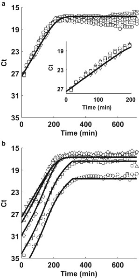
(a) TolC and (b) TraI simulation (solid line) and quantitative PCR data (solid symbols). Each plot represents a different inoculation ratio of donors to recipients: Pure F+ (donor) culture (downward-pointing triangle), 1:1 (upward-pointing triangle), 1:10 (diamond), 1:100 (square), and 1:1000 (circle).