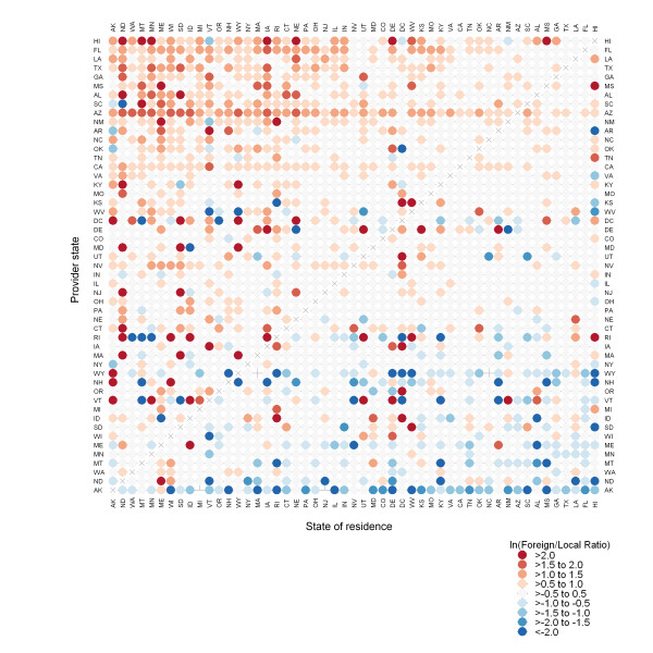
Figure 2.
Comparison of pneumonia and influenza hospitalization rate by time of year, state of residence, and provider state. Orange dots represent areas where the rate of hospitalizations is greater between October and March than between April and September; blue dots represent states where the rate of hospitalization is less between October and March than between April and September. States are ordered by centroid latitude, from north to south.

