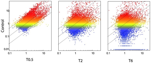
Figure 4. Comparative analysis of TM Gene expression before and after SLT.
Scatter plot analysis comparing gene expression before (vertical axis, Control) and after SLT at various times (horizontal axis, 0.2, 2, 6 h). Gene expression intensity is reported as color scale referring to Control (blue low, red high). The diagonal lines indicate the 2-fold variation interval including genes whose expression did not change after SLT. Genes falling above these lines were downregulated, genes falling below these lines were upregulated more than 2-fold in their expression by SLT.

