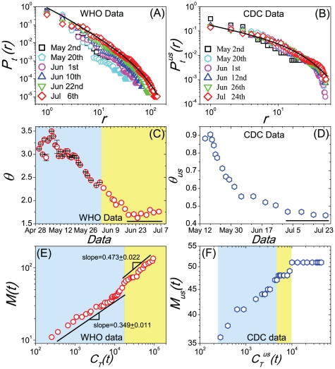
Figure 1. The empirical results of A(H1N1).
(A) The Zipf-plots of the normalized probability-rank distributions  of the cumulated confirmed number of every infected country at several given date sampled about every two weeks, data provided by the WHO. (B) The Zipf-plots of
  at several given data sampled about every two weeks, data provided by the CDC. (C) Temporal evolution of the estimated exponent
  of the normalized distribution
  . (D) Temporal evolution of the estimated exponent
  of the normalized distribution
  of the period after May 15th. (E) The sublinear relation between the number of infected countries
  and the cumulative number of global confirmed cases
  , data collected by the WHO. (F) The sublinear relation between the number of infected states
  and the cumulative number of national confirmed cases
  , data collected by the CDC. The shaded areas in the figures (C,E,F) corresponds to their different evolution stages, respectively.

