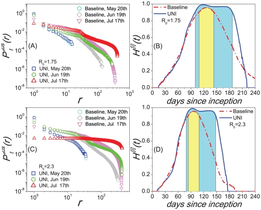
Figure 3. Comparisons of the scaling properties between the UNI scenarios and the baseline cases.
(A,C) present the comparison of the PRD
 of the CCN of every infected MSA/
 SA between the baselines and the UNI scenarios at several given date sampled about every 30 days when
  , respectively. (B,D) present the comparison of the information entropy profiles between the baselines and the UNI results when
  , respectively. Each data in these figures are the median results over all runs that led to an outbreak at the U.S. level in 100 random Monte Carlo realizations.

