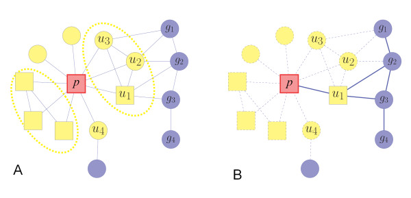
Figure 2.
Illustration of the network inference and modularity measure in CIPHER-HIT. The circle nodes represent the genes and the rectangle nodes represent the phenotypes. The red node denotes the target phenotype p. The yellow nodes (u) denote the adjacent nodes of p, i.e. the set  , referring to either genes or phenotypes. (A) The dashed ellipses enclose the adjacent nodes which share high topological similarity. The nodes u1, u2 and u3 are close to each other. Therefore candidate nodes g1, g2, g3 and g4, which can more easily form a module in the protein-protein network, will be prioritized as the potential disease-genes. The group u1, u2 u3, g1, g2, g3 and g4 will be inferred as a module related to phenotype p. (B) The illustration of the meaning of the conditional Mean-Hitting-Time
  . Among the paths from the candidate genes g to the phenotype p, the influence of the paths passing the adjacent nodes other than u1 are excluded, which are illustrated as dashed lines.

