Figure 4.
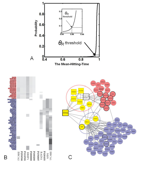
Two subtypes of Breast cancer detected by CIPHER-HIT. (A) The empirical distribution function of MHT(g,{p}) where p denotes the BREAST CANCER and g denotes all genes on the network. The θR threshold = 0.96 at the critical point is selected in the Breast Cancer case. (B) The rows represent the similar phenotypes and disease-genes associated with Breast cancer and the columns represent the prioritized genes. The grey color indicates the closeness between an adjacent node and a prioritized node measured by the conditional Mean-Hitting-Time. Therefore the prioritized nodes are divided into two clusters in which the gene names of the nodes are displayed by red and blue respectively. (C) The yellow squares are the phenotypes with high similarity to Breast cancer and the yellow circles are the disease-genes associated with Breast cancer. For a better illustration, we left out two phenotypes (P120435 and P176807) in (B) with no connections to other nodes in the selected network. The blue and red circles denote two groups of prioritized genes by CIPHER-HIT. The module related to FANCONI ANEMIA locates in the cluster colored red and we added such a phenotype FANCONI ANEMIA in the graph. The protein complex RAD50/MRE11A/NBN locates in the cluster colored blue.

