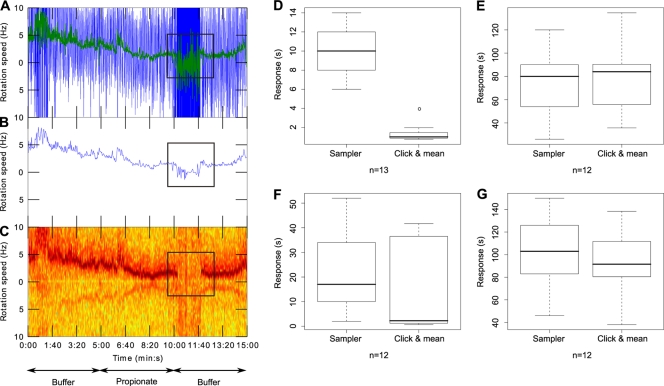
Fig. 2.
Comparison of chemosensory responses analyzed with the “Sampler” software or with “click & mean.” Tethered cell rotation was recorded with an analog camera at 50 fps and processed with AROT7 software. Panels A, B, and C depict the findings for single-cell rotation speed over time. Arrows indicate the solution in the microscope chamber. Black squares highlight the chemosensory response to propionate removal. (A) Instantaneous speed measurements. Colors: blue, raw signal at 50 Hz; green, moving average of the raw signal using a window of 1 s. (B) Signal after “Sampler” processing (window averaging of 100 points). (C) Frequency domain analysis. (D, E, F, and G) Box plots of the different phases of the chemosensory responses and of the overall chemosensory responses obtained with the previous “Sampler” system versus the new “click & mean” system. For each box plot, the lower, middle, and upper horizontal lines of the box represent the first quartile, the median, and the third quartile, respectively. The lower and upper extremities of the dashed lines represent the lowest datum and the highest datum, respectively, which are no more than 1.5 times the interquartile range (difference between the third and the first quartiles) from the box. The circles represent data that are outliers. “n” represents the number of cells analyzed in each panel. The individual panels represent the stopping phase (phase 1) (D), the stopped phase (phase 2) (E), the recovery phase (phase 3) (F), and the overall chemosensory response (G).

