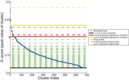
Figure 4.
The resampling method, used to generate thresholds based on the maximum z-score within the cluster. The resampled data (in blue) are sorted and plotted in increasing z-score. Horizontal dashed lines of the z-scores of the original data are overlaid (in green). Three significance thresholds are shown: z = 2.57 threshold (black), p = 0.05 resampled significance threshold (red), and p = 0.01 resampled significance threshold (yellow). The dashed lines of the four clusters from the original data of Goldman et al. (2009), that exceed significance thresholds are colored accordingly: three for which p < 0.05 (red) and one for which p < 0.01 (yellow).

