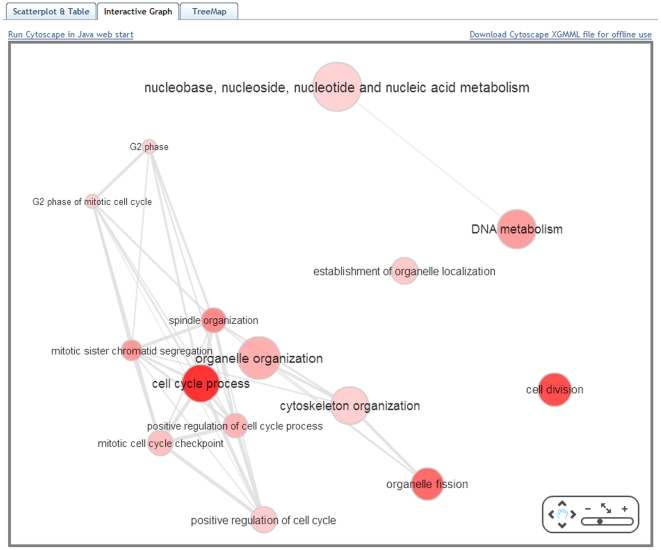
Figure 3. The “Interactive graph” view of REVIGO.
Bubble color indicates the user-provided p-value; bubble size indicates the frequency of the GO term in the underlying GOA database. Highly similar GO terms are linked by edges in the graph, where the line width indicates the degree of similarity. The initial placement of the nodes is determined by a ‘force-directed’ layout algorithm that aims to keep the more similar nodes closer together, but the placement may later be adjusted by the user.

