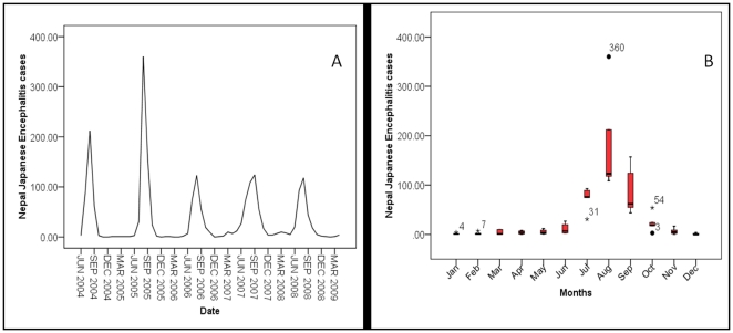
Figure 1. Time Series graph (A) of laboratory confirmed Japanese Encephalitis (JE) cases and a box plot (B) of seasonal transmission of confirmed JE cases from June 2004 to April of 2009.
The dark line in the middle of the boxes is the median value; the bottom and top of the boxes indicates the 25th and 75th percentile respectively; whiskers represents 1.5 times the height of the box; and dots with numbers represent value of outlier cases and asterisks with number represent extreme values outlier cases (i.e. more than three times the height of the boxes).

