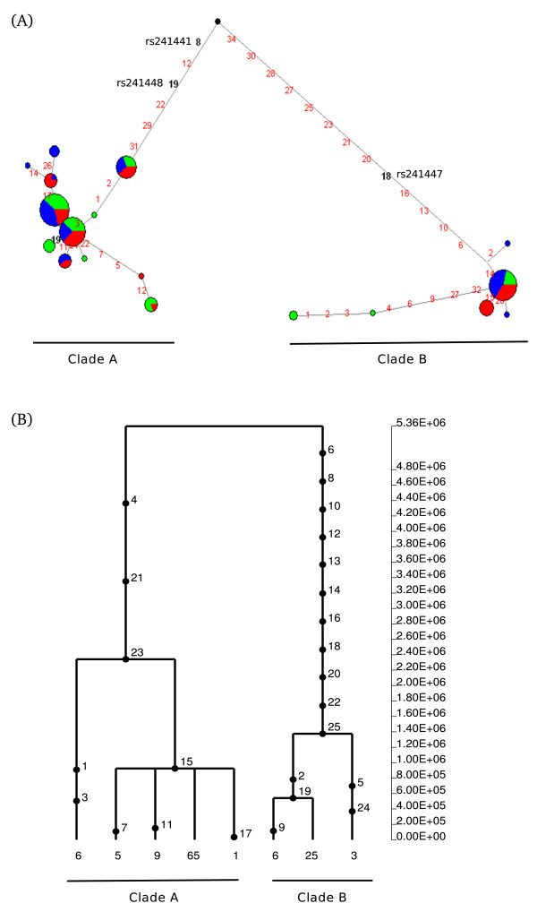
Figure 4.
Haplotype genealogy of the analysed TAP2 region. (A) Network analysis. Each node represents a different haplotype, with the size of the circle proportional to frequency. Nucleotide differences between haplotypes are indicated on the branches of the network. Circles are colour-coded according to population (green: YRI, blue: CEU, red: EAS). The most recent common ancestor is also shown (black circle). The relative position of mutations along a branch is arbitrary. (B) GENETREE analysis. Mutations are represented as black dots and named for their physical position along the regions. The absolute frequency of each haplotype is also reported. Note that mutation numbering does not correspond to that reported in (A).

