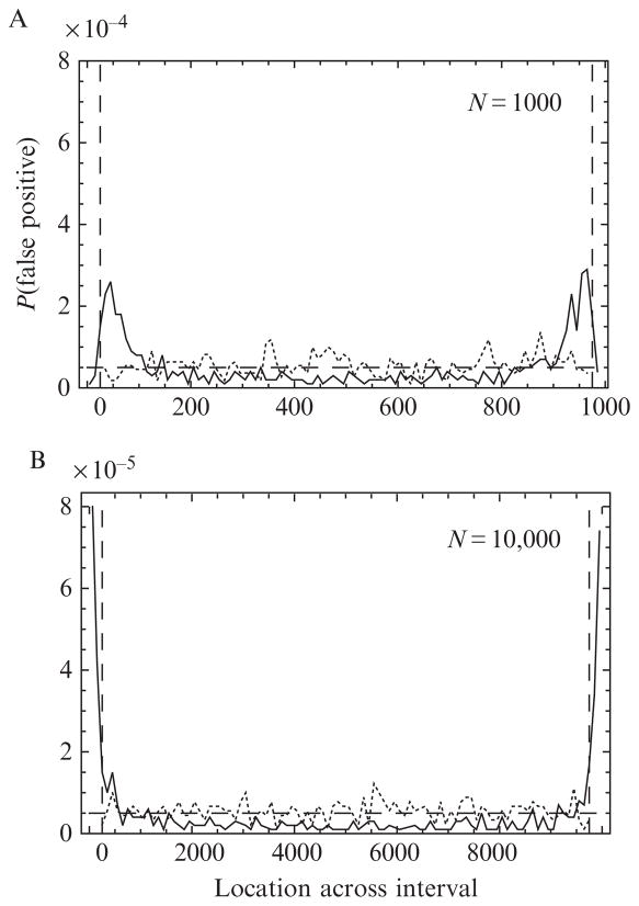
Figure 15.4.
The solid curve shows the distribution of false positives for np = 16 polarization channels across the interval for uncorrected log likelihoods
 ; it is strongly peaked near the edge of the interval, then decays slowly to a minimum at the center. The distribution becomes increasingly peaked as N is increased from N = 1000 (panel A) to 10,000 (panel B). The fraction of the total probability lying within the first and last 5% of each interval is 30% and 60% (instead of 10%) for N = 1000 and 10,000, respectively. Applying the correction factors (see Eq. (15.6)) to the log likelihood and excluding 2.5% of the photons from near the edges (vertical-dashed lines, see Section 4.1.1) result in a nearly uniform distribution of false positives (dotted curve). For comparison, a uniform distribution with total false positive rate 5% would look like the horizontal-dashed line.

