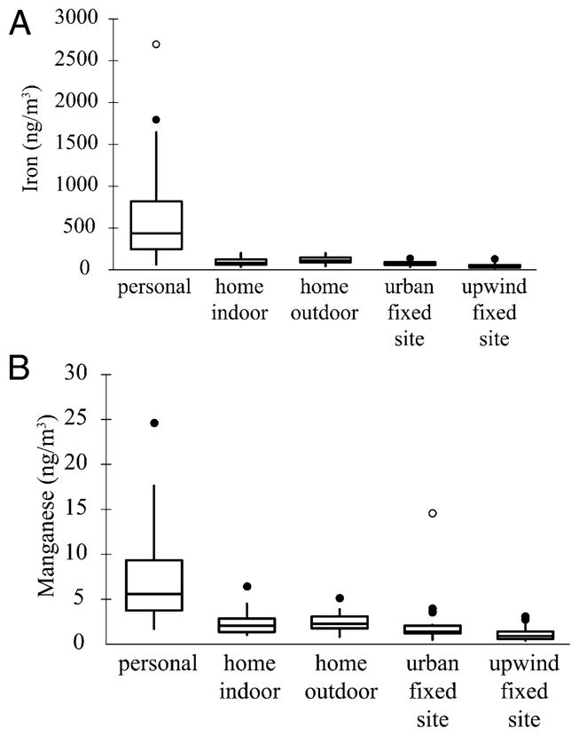
FIGURE 1.

(A) Box plot of Fe concentrations for five types of samples collected in NYC during winter. The solid line within the box represents the median, while the box top and bottom represent the 75th and 25th percentile concentrations, respectively. The tips and tails of the whiskers represent the most extreme data point within an inner fence (not marked on diagram) located at 1.5 times the interquartile range (IQR). Filled circular symbols show moderate outliers or data points that are located between the inner fence and an outer fence defined as 3 times IQR. Open circular symbols show extreme outliers defined as data points beyond the outer fence. (B) Box plot of Mn concentrations for five types of samples collected in NYC during winter. See the figure caption above.
