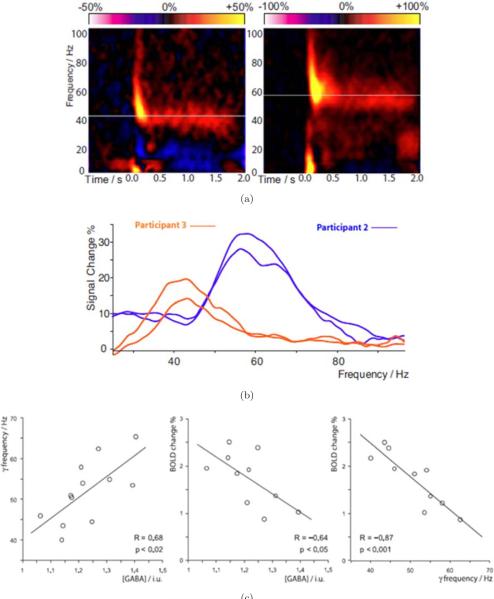
Fig. 5.
Used with permission from Muthukumaraswamy et al. [107]. (a) Time-frequency plots for MEG activity at the maximal response position. Orange/yellow represents power increases and blue/purple indicates power decreases from baseline. In each plot, the white line indicates the peak sustained gamma frequency that showed the greatest change in response to the stimulus. (b) The difference power spectrum, averaged over the period from 0.5 to 2.0 s after stimulus onset. Intersubject differences are visible in both the frequency and amplitude of the gamma response. Note the stability of peak frequency across sessions, which were separated by at least 2 weeks for both participants. (c) Graphs with best-fit linear regression lines, showing for each participant (Left) peak gamma oscillation frequency versus GABA concentration (Center) BOLD response magnitude versus GABA concentration and (Right) BOLD response magnitude versus peak gamma oscillation frequency.

