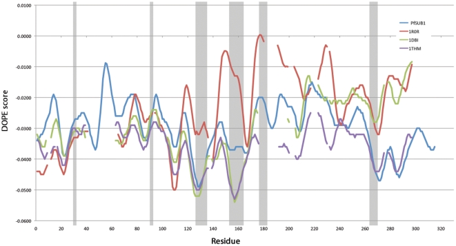
Figure 4. DOPE profile comparison with templates.
The graph shows the DOPE by-residue profile of our best model of PfSUB1 against three templates used in the modeling where in gray are shown the residues forming the binding region. Despite a region with a high energy (around residue 60) all regions forming the binding region show a relatively good DOPE energy. Missing values in the templates are due to gaps in the sequence alignment.

