
FIG. 2.
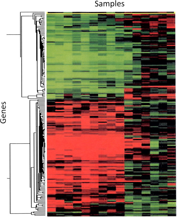
Example of typical “clustering” figure. Individual gene expression profiles are grouped according to similarity on the x- and y-axis. Each column represents an individual animal gene expression profile (compound-exposed liver). Each row represents an individual gene in the profile. The red color indicates that a gene is increased in the compound-treated samples relative to vehicle controls. Green color represents a decrease in expression of the compound-treated samples relative to vehicle controls.