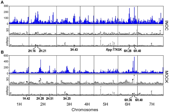
Figure 5. Distribution of eQTL, hotspots, and differentially expressed genes across the QSM genetic map in INOC (Pgt race TTKSK) and MOCK experiments.
(A) Top: Histogram of eQTL in the INOC experiment. Middle: Log10 of the contingency χ2 p-value for regions over- or under-sampled for genes with eQTL differentially expressed in response to Pgt race TTKSK, as illustrated by closed and open circles, respectively, above the threshold cutoff of p = 0.001 (dashed line). Bottom: Log10 of the contingency χ2 p-value showing regions containing a significant proportion of genes either over or under-represented. Positive (hotspots) and negative (coldspots) are illustrated by closed and open circles, respectively, above the threshold cutoff of p = 0.001 (dashed line). (B) Ordered similarly to (A) showing data for the MOCK experiment.

