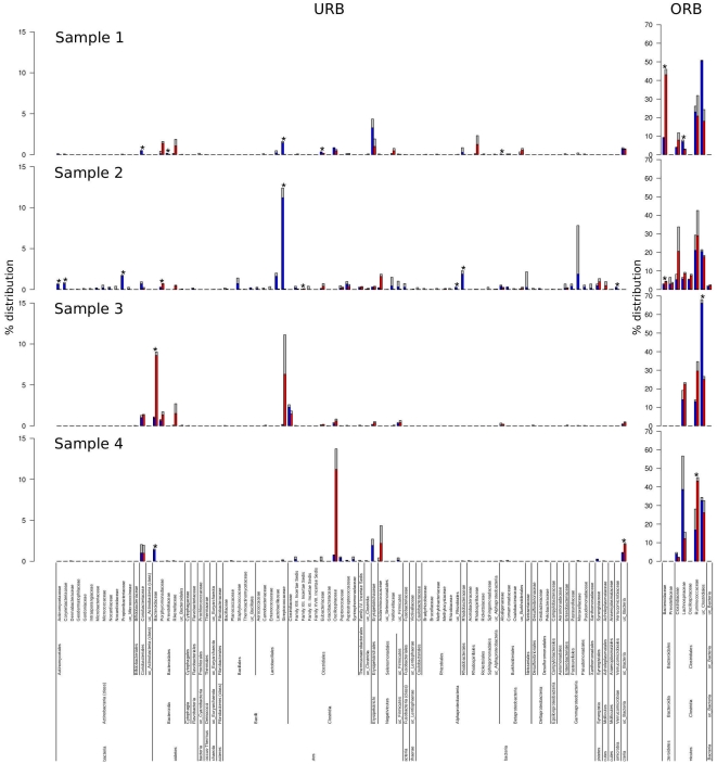
Figure 5. Families histogram.
The histograms describe the distribution of URB and ORB families among total and active fractions. On the bottom, taxonomy ranks are reported. Bars describe percentage distribution of underrepresented (less than  , left) and overrepresented (more than
  right) families. Blue and red bars describe median distribution of active (HC plus LC and PA fractions) and total (FS and R fraction) respectively. Gray bars indicate the maximum values for each family. Asterisks indicate statistically significant difference (p-value
 = 0.05) between active and total fractions (abbreviations as in Figure 1).

