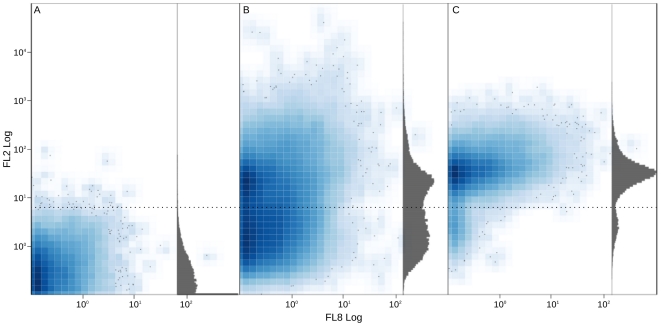
Figure 6. Cytometry dotplot.
The three panels show the distribution of events in FL8 PMT versus FL2 PMT. X and Y axis are defined in logarithmic arbitrary units. Gray histograms resume the distribution of events along FL2 PMT. Panel A shows unstained cells. Panel B shows cells stained with pyronin-Y with trigger in SS PMT; it is possible to appreciate the two populations of unstained and stained cells respectively (dotted black line separates the two populations). Panel C shows only pyronin-Y stained cells passing the threshold on FL2 PMT.

