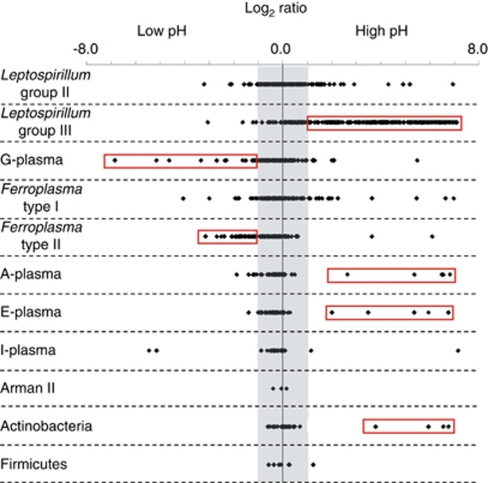
Figure 3.
Distribution of average protein abundances for quantitative proteomic comparison of communities maintained at high and low pH. Log2 ratios for all proteins are plotted according to taxa. Positive log2 ratio values indicate proteins more abundant in high pH communities; negative values indicate proteins more abundant in low pH communities. The shaded area denotes values between 1 and −1 (within 2 × ), in which proteins are not considered significantly different between high and low pH comparisons. Red boxes highlight proteins from organisms that exhibited a strong response to either high or low pH. The color reproduction of this figure is available on the html full text version of the manuscript.

