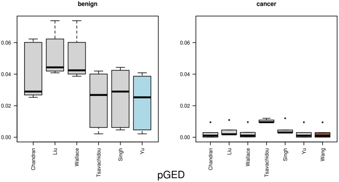
Figure 4. The results for pGED.
This figure illustrates the distances from one network to all other networks, based on the normalized Graph Edit Distance pGED. In the left part it depicts the distances between one benign network and all other benign networks, whereas in the right part it lists the distances for one cancer network to all other cancer networks. The networks that are selected as graph prototypes are highlighted in different colors (benign = blue, cancer = brown).

