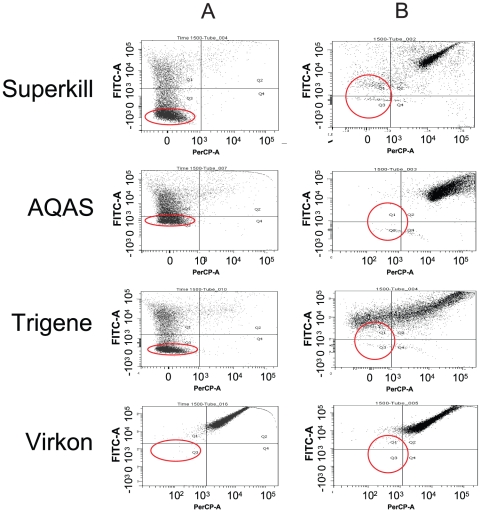
Figure 1. Analysis of the impact of biocide exposure on a population.
Flow cytometry analysis of 10,000 S. Typhimurium cells after 5 hours challenge with a) low dose (SK 0.005%, AQ 0.005%, TR 0.002% and V 0.4%) and b) in-use concentration (1%) of 4 different categories of biocide. For each plot, the x-axis plots PI fluorescence and the y-axis BOX fluorescence. Quadrants represent: lower left, PI− BOX− therefore ‘healthy’; upper left, PI− BOX+ therefore intact but depleted membrane potential (‘unhealthy’); upper right, PI+ BOX+ therefore disrupted membrane and membrane potential and likely to be dead. The circles indicate cells sorted for further investigation.

