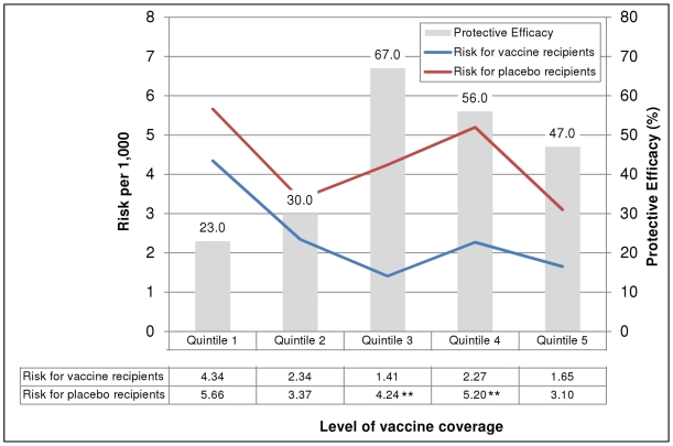
Figure 3. Risk of cholera and protective efficacy of killed oral cholera vaccines, by level of vaccine coverage in household-level social networks.
** p<0.01 for the difference in risk between vaccinees and placebo recipients. Note: Quintile values are as follows: <27.2%, 27.2-40.0%, 40.1-50.0%, 50.1-62.5%, >62.5%. GREY bars show vaccine protective efficacy by quintile of vaccine coverage within social networks developed using household-level kinship connections. The number shown above each bar is the calculated protective efficacy. The RED line indicates the risk of cholera for placebo recipients while the BLUE line indicates the risk of cholera for vaccine recipients by quintile of vaccine coverage within social networks. The numbers contained in the table below the graph indicate the calculated cholera risk for each group. An asterisk (**) indicate that the cholera risk per 1,000 was significantly different between the placebo and vaccine groups (e.g., the confidence intervals for the two calculated rates did not overlap). Quintiles show the proportion of a person's social network that was vaccinated (e.g., for quintile 1, <27.2% of people in an individual's social network were administered the cholera vaccine).

