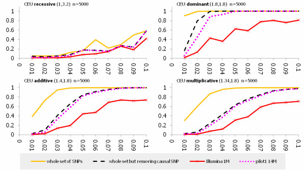
Figure 5.
Power estimations for testing association of low frequency alleles from the CEU population with simulated sample size n = 5000. The X axis represents allele frequency and the Y axis represents power. Solid line represents the power curve for the whole set of SNPs from the CEU population in the exon pilot, the dashed line represent the power curve for the set of all SNPs from the CEU population in the exon pilot except for the putative causal SNP. The dotted line represent the power curve for the low coverage Pilot 14 M dataset, and the solid line with the star represents the power curve for the Illumina 1 M. Values in parentheses are the heterozygous and homozygous relative risk, respectively. Only putative causal SNPs in the low frequency region are presented.

