
Figure 3. Worse hip range of motion over time in untreated alkaptonuria patients.
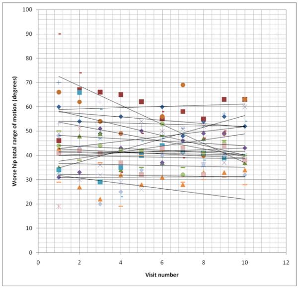
Each set of symbols represents one patient’s total hip range of motion at each visit over the 36 month study period. Best fit lines are drawn depicting the trend of the total range of motion over time. For the purpose of this figure, individuals who died or had their second hip replaced have their data truncated at the time of the event, rather than going to zero as used in the statistical analysis.