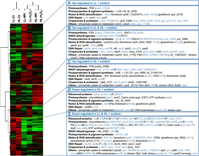
Figure 8.
Two-way cluster analysis diagram of gene expression data. This analysis is based on 1,548 genes corresponding to all genes present on the array but microarray controls, small RNA oligonucleotides, as well as unknown and hypothetical protein-encoding genes. Each row in the diagram represents a gene, and each column represents a light acclimation or a stress condition. The dendrogram at the top is similar to Figure 6, except that each column was obtained from the mean of four biological replicates performed for each condition. The color saturation represents differences in gene expression across the samples: red indicates higher than median expression (black), and green indicates lower than median expression. The color intensity indicates the degree of gene regulation. The boxes to the right represent gene clusters A to E and show some of the genes present in these clusters and belonging to specific functional categories. Genes showing a statistically significant differential expression in at least one condition (Student’s t test and/or LIMMA with FDR ≤ 0.05) are indicated in blue.

