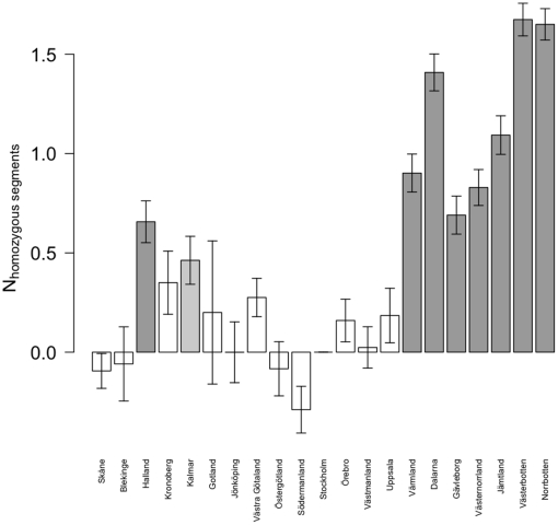
Figure 5. Poisson model of the mean number of homozygous segments in each county.
Bar chart of estimates of regression coefficients, with standard error bars. Model uses Stockholm county as baseline and adjusts for source study. Dark gray bars p<10−5, light gray bars p<0.05, white bars p> = 0.05 (with p values adjusted for the multiple testing of 20 counties). Counties are sorted south to north.

