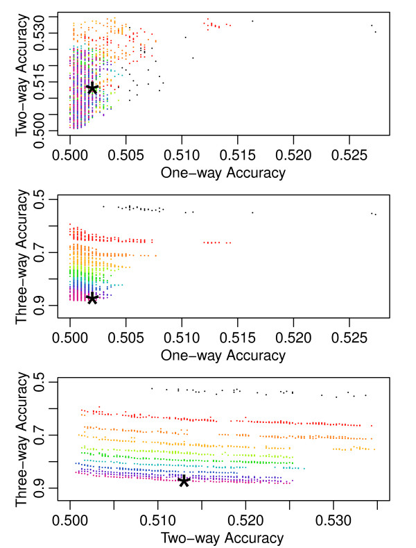
Figure 3.
Progress of the Pareto Fronts over Thousands of Generations. This figure maps the progress of one run of the three-way algorithm across the 2000 generations of the evolution strategy. Instead of a single three-dimensional graph, we decomposed the illustration into three pairwise plots in which each solution dataset drawn appears once on each plot. Each dot represents a dataset from a Pareto front and shows how that dataset scored on the x and y-axis attributes. The axis are drawn so points closer to the bottom-left corners of the plots represent more optimized solutions. The black dots represent the non-dominated solutions from the original random initialization of 1000 datasets. The Pareto fronts from every subsequent two-hundredth generation are drawn and assigned a color based on their generation. The chronological generation progression follows the colors of a rainbow and can be most easily discerned from the bottommost plot. The star indicates the dataset that was chosen from the final Pareto front to represent the run. These datasets are taken from each run, according to the euclidean distance strategy discussed in the Model Free Dataset Generation Method section, and used to calculate the summary statistics in Table 1. This figure provides insight into the difficulty of the problem. Minimizing the one and two-way accuracies occurs relatively quickly (within the first few hundred generations). Maximizing the higher order accuracies continues throughout the entire run with progress continuing into the two-thousandth generation.

