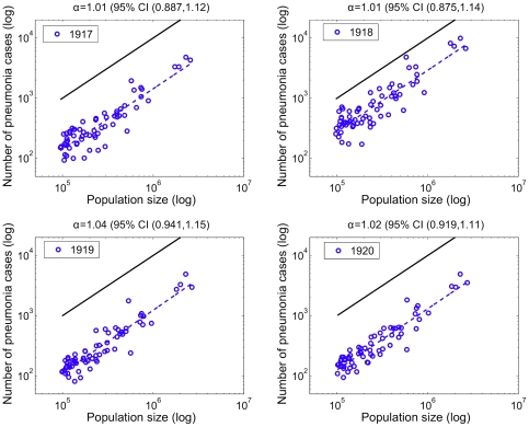
Figure 5. Relationship between the number of pneumonia deaths and population size for 66 US cities.
Relationship between the total number of pneumonia deaths and population size for the 66 US cities. The dashed blue line represents the best linear fit to the data in log-log scale. A solid black line representing a slope of one is shown as a reference to illustrate the expected relationship if pneumonia mortality rates did not vary with population size. The slope of the observed data is ‘linear’ (not significantly different than one) for all years suggesting invariant death rates before and during the 1918 infuenza pandemic.

