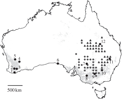
Figure 1.
Geographical origin of sampled populations of the Australian plague locust. The map was generated using Quantum GIS (QGIS) 0.11.0 (http://www.qgis.org). Grey areas represent croplands based on the Land Cover Map for Australia in the year 2000 [31]. Triangles and diamonds, respectively, represent populations from the demographically independent northeastern and southwestern areas (i.e. the upper level of demographic structuring inferred from hierarchical clustering and cross-correlation analyses of density time series across eastern states of Australia).

