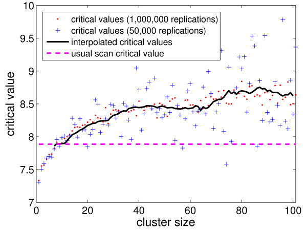
Figure 6.
Data-driven critical values for the Northeastern US map for the various k size values, using 1,000,000 (respectively 50,000) replications, displayed as red dots (respectively blue crosses). The solid black curve represents the moving average, of window size 20, of the critical values associated to each size k > 10 using the 50,000 replications set (blue crosses).

