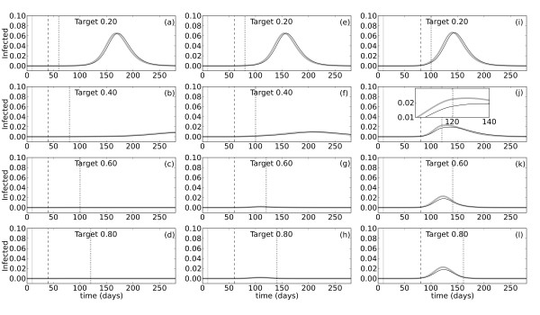
Figure 4.
Effects of vaccination in the non-proportional model given different levels of population coverage. Simulations were performed using the non-proportional model of vaccination with  . The pulse inserting infected individual(s) into the susceptible population occurs at t0 = 10 (gray solid vertical lines). The proportion of people infected over time is plotted for vaccination start times, ta = 20 (a-d), ta = 50 (e-h), and ta = 80 (i-l). Start times are indicated with dashed lines in each panel. The target level of vaccination coverage in the total population varies between 20% and 80%, as indicated. Dotted lines mark the end of the vaccination campaign when the target coverage level is reached. The probability of being confirmed, p, is set at either 0.20 (thick gray lines) or 0.65 (thin black lines), and b adjusted accordingly such that R0 = 2.0 for all simulations. Note that the gray and black lines overlap. The inset in panel (i) illustrates the change in the epidemic dynamics at the time vaccination ends.

