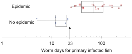
Figure 3. Epidemics and worm days for a primary infected fish.
The box plot shows worm days per primary infected fish for epidemics and non epidemics. Boxes show quantiles, while whiskers show ranges. Points are individual tanks and are jittered on the vertical axis to reduce overlap. The figure is a simplified version of the data in Figure 2.

