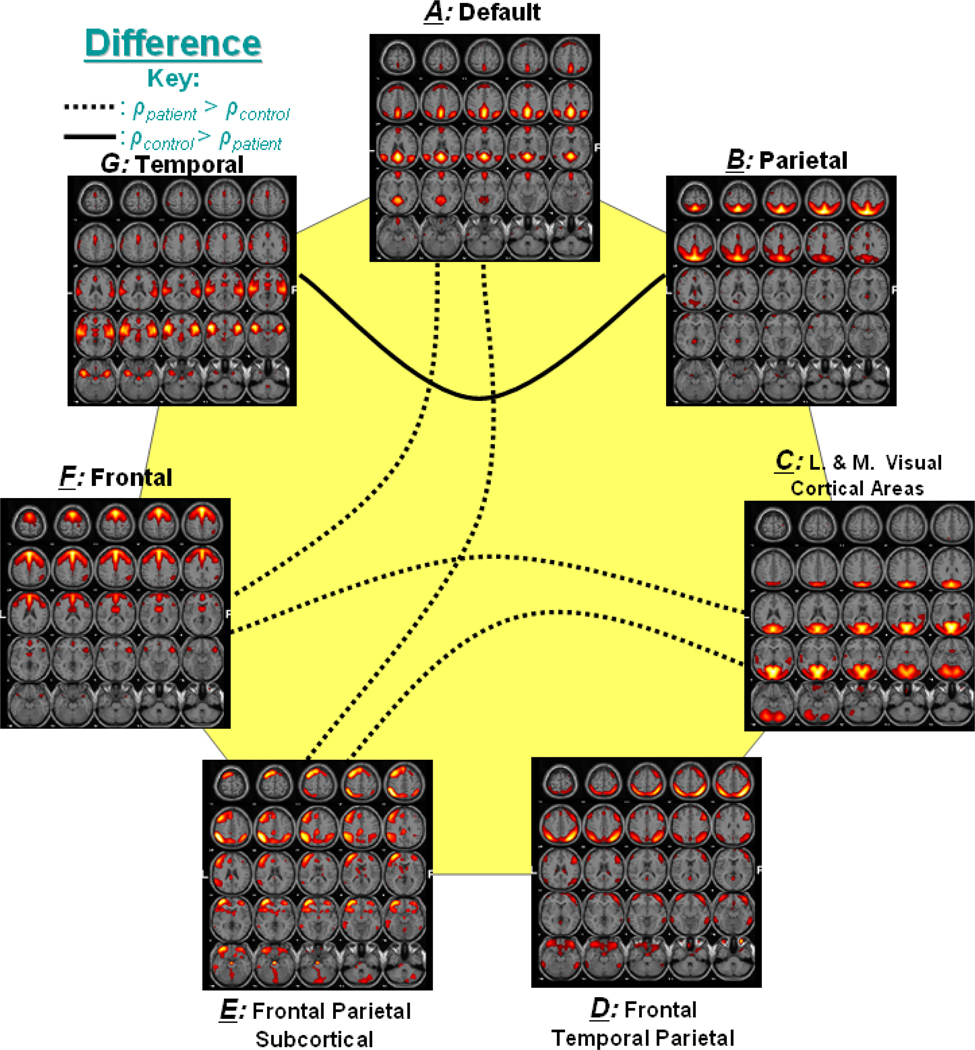
Figure 4. Significant Correlation between Group Differences.
Out of 21 possible correlation combinations between 7 components, only 5 combinations passed the two sample t-test (p < 0.01). The solid line represents the significant connectivity where controls have higher mean correlation than patients, while dotted line represents connectivity where patients have higher mean correlation. Presence of dotted lines rejects the hypothesis that controls should have more correlation between two components than patients.

