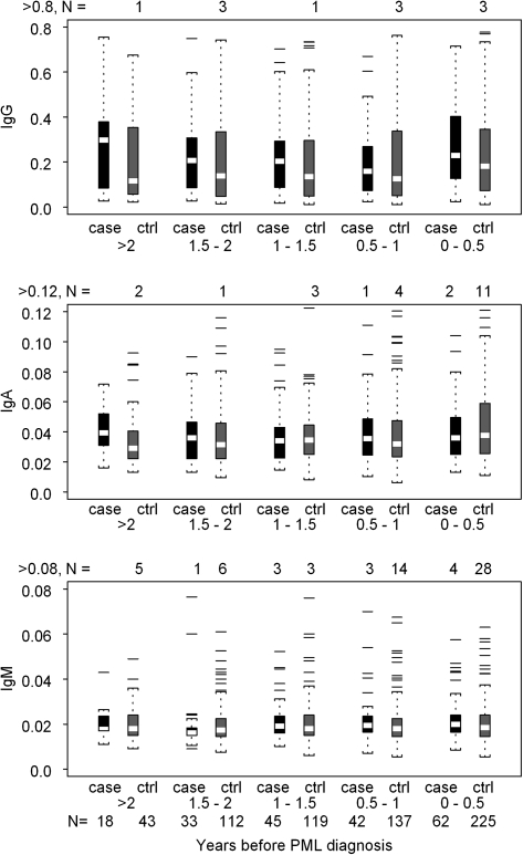
Figure 1.
Distribution of IgG, IgA, and IgM absorbance values of sera from PML cases and HIV disease matched controls in the MACS and SHCS at time intervals before the diagnosis of PML. The summary statistics of each distribution are displayed in a box plot. The length of the box corresponds to the interquartile range with the upper boundary of the box representing the 75th percentile and the lower boundary the 25th percentile. The horizontal clear line in the box represents the median value. The 10th and 90th percentiles are shown by the small bar at the end of the line extending downward or upward, respectively, from the box. Each outlier value is shown individually by a solid line. The number of outliers that are not displayed in the graph space is indicated at the top of each graph. The number of samples contributing to each distribution is indicated at the bottom of the figure.

