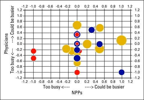
Figure 4.
Perception of workload and patient encounters per full-time equivalent (FTE) provider. Each circle represents a practice; their size and color indicate practice productivity based on the number of patient encounters per FTE provider in the reporting period. The smaller red circles indicate below average productivity; blue is average; and the larger gold circles indicate greater than average productivity. The horizontal axis reflects the nonphysician provider (NPP) perception of workload and the vertical axis the physician perception. Circles in the upper right quadrant represent sites where both physicians and NPPs think they could see more patients. Circles in the lower left quadrant represent sites where both the physicians and the NPPs think they are seeing too many patients.

