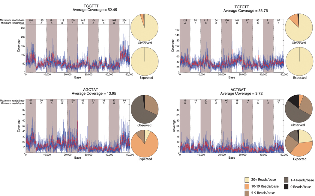
Figure 3. Relationship between mean and local coverage.
Example coverage of 4 individuals sequenced within a single line of an 8-lane flow-cell for 10 pooled amplicons as part of Library A. Amplicons are shown consecutively for each individual by the alternating shaded background. Index sequence and mean coverage for that individual are shown above each graph. The maximum and minimum coverage is shown for each amplicon in the top of the graph. Overlaying pie charts show the observed distribution of bases across all amplicons and the expected distribution determined from a Poisson distribution of the mean coverage, binned by 0 reads, 1–4 reads, 5–9 reads, 10–19 reads, and >20 reads.

